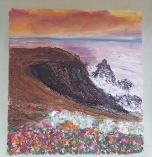
View attachment 39380
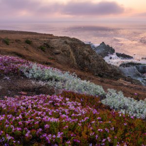
As you can see the one you are using for reference and yours side bya side .. the sky and wanter can get by .. you
nee a bit of darkin the far cliff to punch agains the whites and the bottom diagnol of the flowers down.
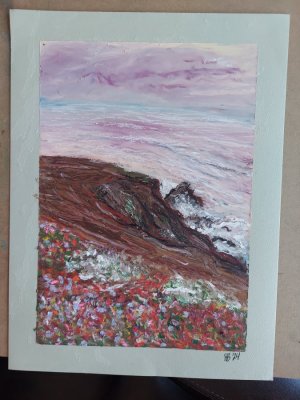
Here they are with me darkening the values in the photo of your painting.
View attachment 39381
as you can see I darkened the one spot on the rocks. You can add a few small ones if you will. I also did the whole of the bottom diagnol .. it now looks right .. I wouldn't worry too much about color. Get the values first and any color will work. Oh I forgot .. you missed an arm of the rocks which balances the ground to the water and horizontal line.
Gotta go now I got a hockey game to watch ... good luck.
View attachment 39384
") So start your base sketch layer with a good hard OP (usually contain less wax/oil), and stick with those for another layer or two before reaching for your softer brand (more wax/oil). By then your soft ones should easily go over the nice hard base without disturbing your sketch lines. A sturdier painting should result.
So start your base sketch layer with a good hard OP (usually contain less wax/oil), and stick with those for another layer or two before reaching for your softer brand (more wax/oil). By then your soft ones should easily go over the nice hard base without disturbing your sketch lines. A sturdier painting should result.